

'%20x='0'%20y='0'%20height='100%25'%20width='100%25'%20%0A%20%20%20%20%20%20%20%20%20%20xlink%3Ahref='data:image/jpg;base64,/9j/2wBDAAYEBQYFBAYGBQYHBwYIChAKCgkJChQODwwQFxQYGBcUFhYaHSUfGhsjHBYWICwgIyYnKSopGR8tMC0oMCUoKSj/2wBDAQcHBwoIChMKChMoGhYaKCgoKCgoKCgoKCgoKCgoKCgoKCgoKCgoKCgoKCgoKCgoKCgoKCgoKCgoKCgoKCgoKCj/wAARCAAGAAoDASIAAhEBAxEB/8QAFgABAQEAAAAAAAAAAAAAAAAAAAYH/8QAIRAAAQMEAQUAAAAAAAAAAAAAAQIDEQAEBSETBiIxQWH/xAAUAQEAAAAAAAAAAAAAAAAAAAAE/8QAGhEAAgMBAQAAAAAAAAAAAAAAAxEAAQITM//aAAwDAQACEQMRAD8Apr265cULtptph1ohRdSmVhKdwN69anxWQO9aYkOrBsr1RCj3cgE/YnVKUEe9G9Laj6HkL50nP//Z'%3E%3C/image%3E%3C/svg%3E)
Since JoJo's Bizarre Adventure: Steel Ball Run has been confirmed to be adapted into anime, fans have been beyond thrilled, as it is considered to be Araki's best work. David Productions are the official producer working on animating this series, had ensured fans that they would not be disappointed, but recently, when the production team released a new key visual, the fan reception did respond with their usual enthusiasm.
This visual has been illustrated by the character designer, who is also the chief animation director, Daisuke Tsumagari, and since it has been made public, the fandom is unexpectedly split about it. While some fans appreciate the stylistic choices, many others are expressing disappointment and concern over the character proportions, shading, and overall presentation. And as always with JoJo, the debate is loud and immediate.
Why do fans think that something looks “Off”
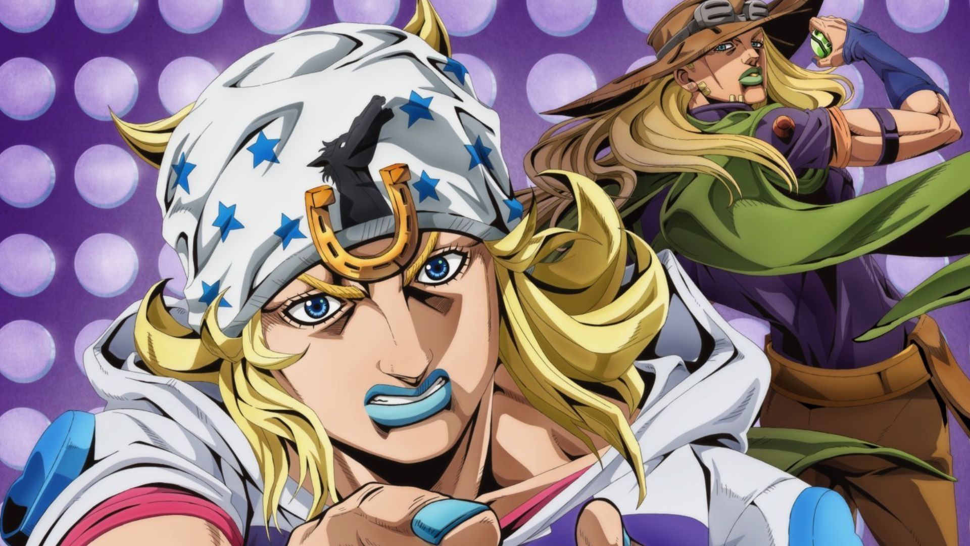
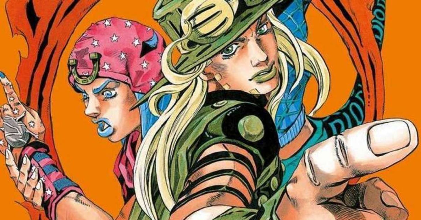
The biggest issue that people are talking about with this key visual is how Johnny Joestar is drawn. Fans are pointing out that his facial structure appears to be rounder and shorter, and feel like they do not know this character anymore. Many of them are even comparing this with the manga and initial cover art, which felt like it matched the aesthetic of Araki, and now, fans are feeling robbed. One fan on X has noted:
"johnny joestar's anime design in the promo stuff has been really strange. not bad...just strange lol i'm still holding out for the anime itself but the promo art is very square and fish-like"
Now, the inconsistency has created fear that the animation might vary widely from scene to scene. For a part with this much cultural weight, fans are understandably sensitive to anything that feels unstable or experimental. Those who have read the manga have fallen in love with the art and the story, as it is a complete package, and the expectations from the anime remain high because this part deserves that kind of respect. Another netizen on X pointed out:
"in retrospect I kinda get why people were worried initially after the trailer cause that’s not really what Johnny looks like lmao. who is this man impersonating him… plus it just looks kinda generic. you’d barely be able to tell it was jojo if u didn’t know"
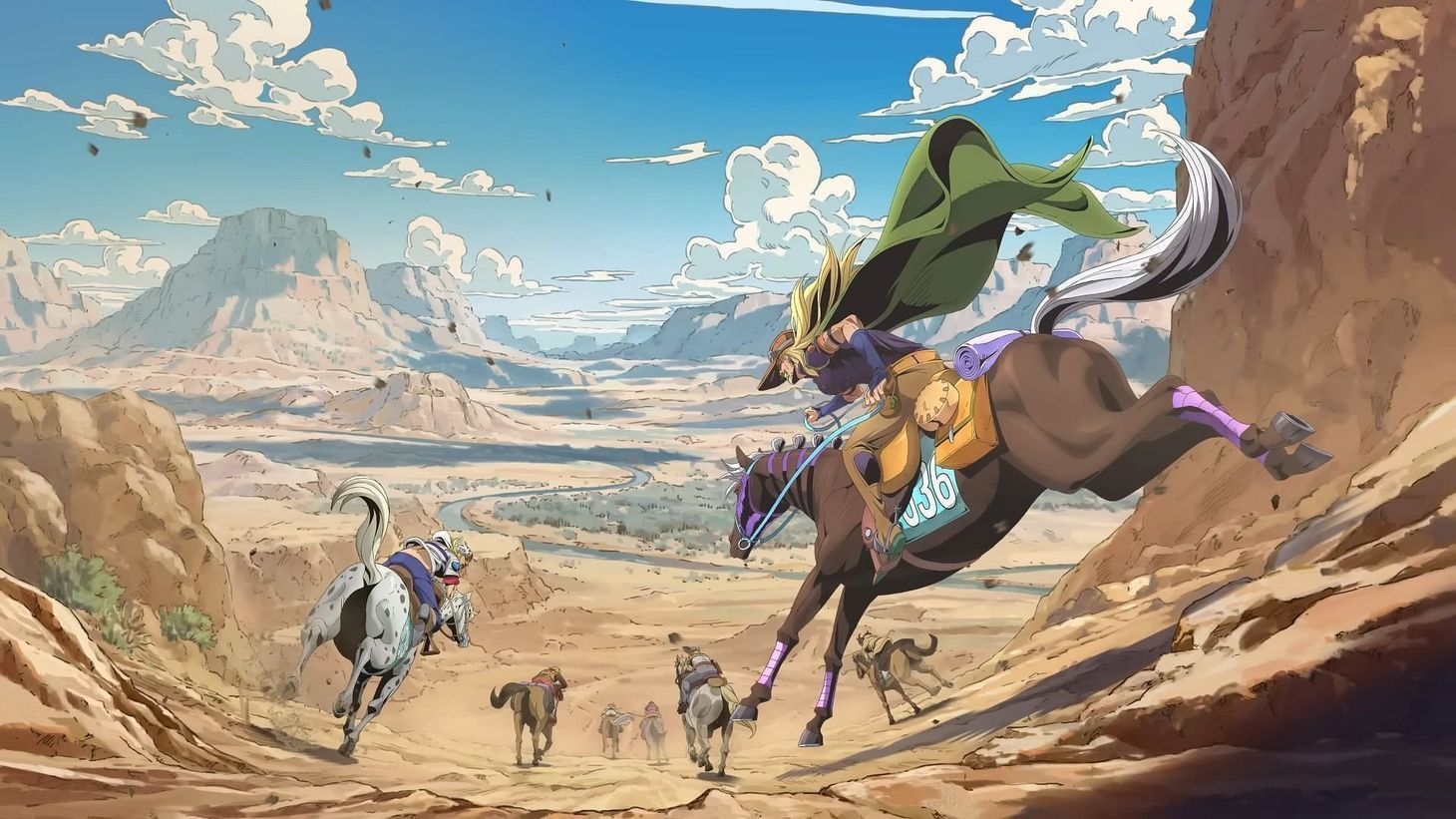
For a story as gritty and atmospheric as JoJo's Bizarre Adventure: Steel Ball Run, some viewers worry this softer, more digital style won’t capture the tone they imagined. Lately, some popular franchises have also fumbled with animation, which has caused loyal fans to be disappointed. The reason why Steel Ball Run took so much time to get an anime adaptation is because of horses. Although one fan on X holds onto hope by saying:
"think character designs will improve over time. Part 7 has more realistic designs compared to previous seasons, so it's reasonable that more time is required for their mastery."
Yes, animating a show that is primarily focused on horse racing makes an animator's job much harder. While fans were happy that they were getting a series, this concern was on the back of their minds, and now many of them are getting jittery as this key visual, which was supposed to keep the hype alive, has taken a turn for the worse.
Why did the key visual for JoJo's Bizarre Adventure: Steel Ball Run receive backlash?
Three major factors explain the negative reactions:
- Sky-high expectations
- JoJo's Bizarre Adventure: Steel Ball Run is widely considered Araki’s masterpiece, and fans have waited nearly a decade for an anime adaptation. Any deviation feels magnified.
- Inconsistency across promotional materials
- Each new piece of art has presented slightly different versions of Johnny and Gyro, leading to concerns about animation stability.
- A stylistic shift that feels unfamiliar
- The softer digital shading and absence of heavy hatching make the visual feel less gritty than fans expected from this particular part.
Whether the new key visual is viewed as flawed, experimental, or simply different, one thing is clear: JoJo's Bizarre Adventure: Steel Ball Run fans are deeply invested in this adaptation. No matter the debates or disagreements, the excitement surrounding SBR remains stronger than ever.