

'%20x='0'%20y='0'%20height='100%25'%20width='100%25'%20%0A%20%20%20%20%20%20%20%20%20%20xlink%3Ahref='data:image/jpg;base64,/9j/2wBDAAYEBQYFBAYGBQYHBwYIChAKCgkJChQODwwQFxQYGBcUFhYaHSUfGhsjHBYWICwgIyYnKSopGR8tMC0oMCUoKSj/2wBDAQcHBwoIChMKChMoGhYaKCgoKCgoKCgoKCgoKCgoKCgoKCgoKCgoKCgoKCgoKCgoKCgoKCgoKCgoKCgoKCgoKCj/wAARCAAGAAoDASIAAhEBAxEB/8QAFgABAQEAAAAAAAAAAAAAAAAAAAIF/8QAIBAAAQMEAgMAAAAAAAAAAAAAAQIDEQAEBQYHQRIiMf/EABQBAQAAAAAAAAAAAAAAAAAAAAP/xAAdEQACAQQDAAAAAAAAAAAAAAABAgADBBEhMVHw/9oADAMBAAIRAxEAPwDFyHImw3uMebFwloWt6oOKb9CsBUtAR8AiFDura3Pbg0gO5G2W4APJQYAk9mIpShuarqFwx2O4TADge1P/2Q=='%3E%3C/image%3E%3C/svg%3E)
For years, One Piece fans have speculated about every little detail Oda hides in his sprawling world. From devil fruit abilities to the mysteries of the Void Century, no theory is too small to capture the community’s imagination.
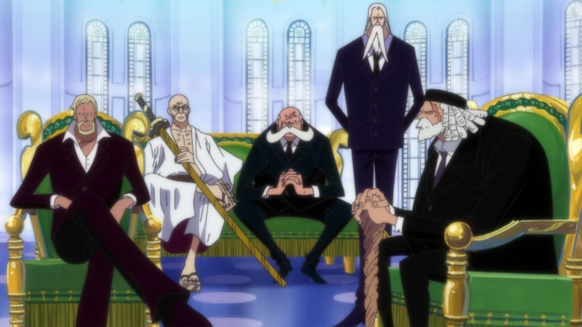
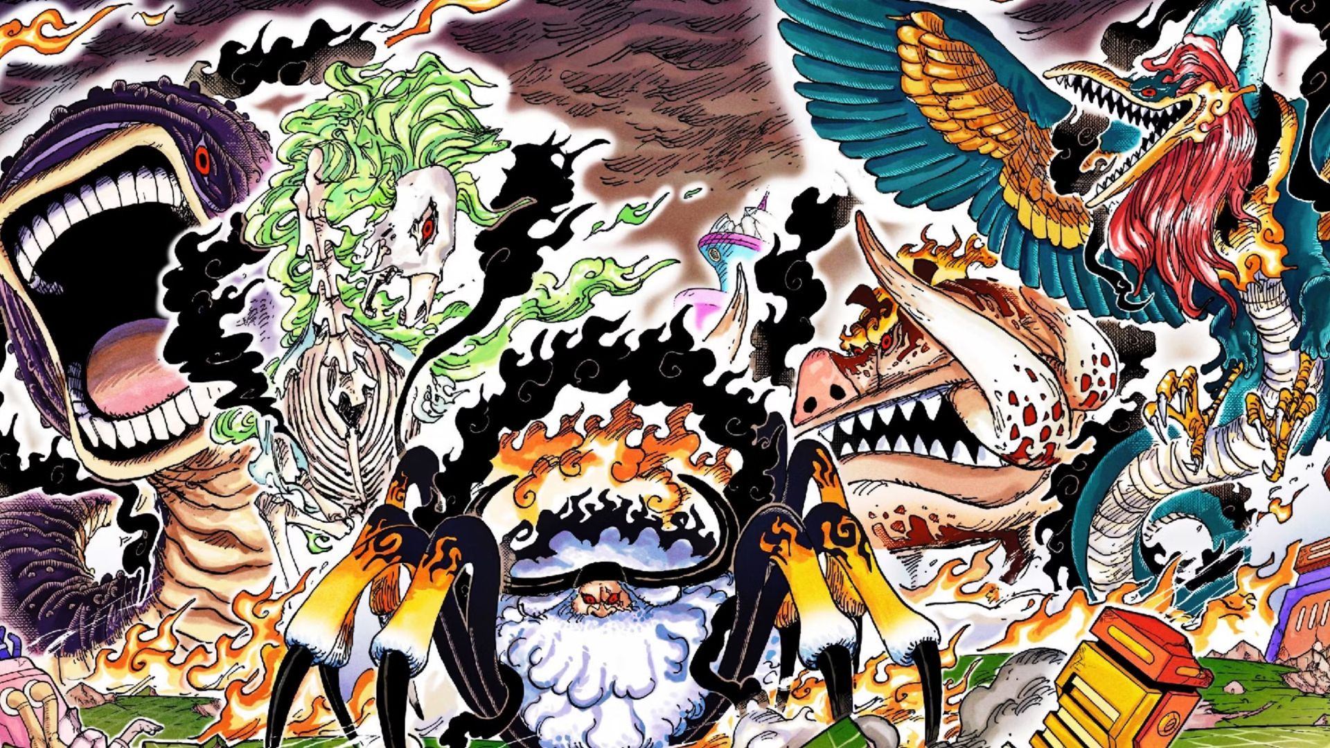
But sometimes, it is the simplest revelations that spark the most conversation. That is exactly what happened when Toei and Oda’s team officially unveiled the color schemes for the Gorosei, the Five Elders who stand at the very top of the World Government.
The Gorosei: Saturn, Mars, Warcury, Ju Peter, and Nusjuro, have long been shrouded in mystery. For decades in the manga, they appeared only in shadowed rooms, clad in dark suits, carrying the aura of political power and absolute control.
They were feared not because of flashy designs, but because of their authority: The highest-ranking Celestial Dragons, able to command admirals, erase history, and summon devastating military power without consequence.
Each Elder’s design in One Piece came to life in a way that surprised almost everyone. Some looked grotesque, others majestic, and some even a little cartoonish. And while fans were divided on whether the choices were genius or disappointing, everyone agreed: These color schemes were not what they expected.
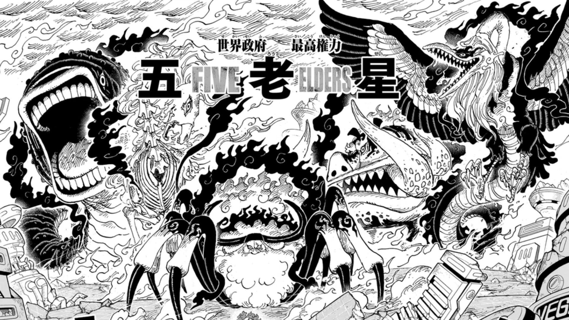
Breaking down the Gorosei’s color scheme in One Piece
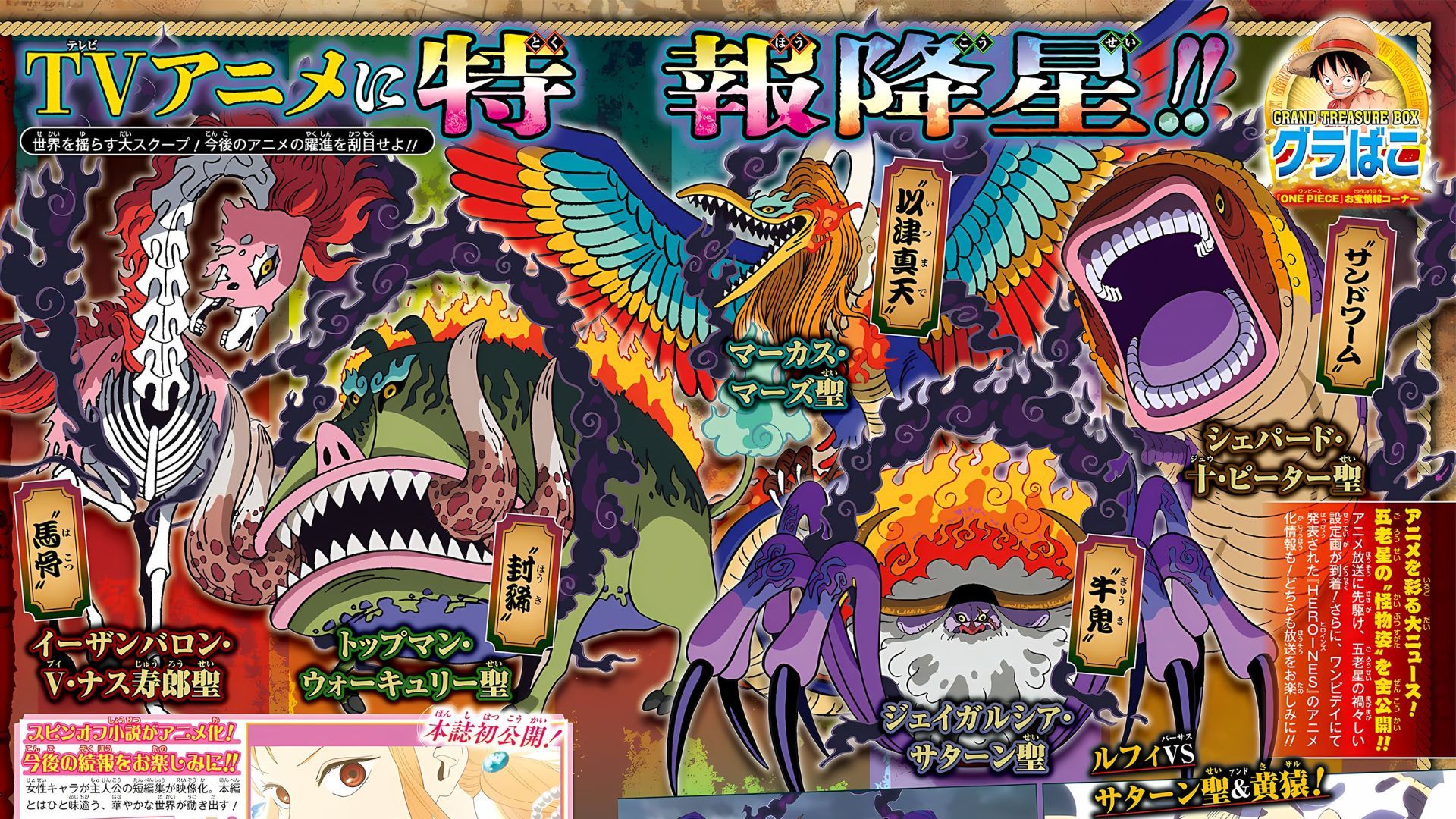
Saint Jaygarcia Saturn: The Ox-Spider demon (Gyūki)
Saturn in One Piece was the first Elder we saw in full combat mode during the Egghead arc. His design, half spider, half bull, is already horrifying, and his muted, darkish tones in the official reveal were perhaps the least controversial of the group. Many fans agreed Saturn’s coloring fit his role as the face of the Elders in combat.
Saint Ethanbaron V. Nusjuro: The skeletal horse
Nusjuro may have gotten the biggest surprise factor. Instead of the ghostly blues or pale whites fans imagined for his undead horse form, his official coloring leaned heavily into red. His mane glows in fiery hues, giving him an almost phoenix-like flair. Some fans loved the boldness; others felt it made him look less menacing. Still, the red contrasts with his skeletal frame, suggesting a creature straddling life and death.
Saint Shepherd Ju Peter: The sandworm
Ju Peter’s worm form in One Piece was already meme-worthy, with many comparing him to a Pokémon. The official colors only amplified that effect: Bright, rainbow-like tones with flashy details. Some fans were baffled, others delighted. Still, the choice raises a question: Is Oda intentionally softening the Gorosei’s intimidation factor with unexpected flamboyance?
Saint Marcus Mars: The itsumade (Snake-bird yokai)
Mars, transformed into a winged serpent-bird yokai, received one of the flashiest palettes of all. His wings shimmer with rainbow tones, making him look almost divine rather than demonic. Many fans compared him to festival costumes or carnival designs. Some disliked it, saying they wanted Mars to strike fear, not a spectacle. Others pointed out that the overwhelming brightness may symbolize his arrogance, an enemy so confident that he flaunts his power like a peacock.
Saint Topman Warcury: The four-tusked boar
Perhaps the most divisive reveal was Warcury. With a grotesque boar-like form, fans expected earthy browns or blackish tones. Instead, Warcury was given a sickly green palette, making him appear almost rotten. For some, it was fitting, a god of “justice” corrupted into something decayed. But in terms of thematic symbolism, green could represent the rot of the World Government itself, decayed authority hiding behind a veneer of righteousness.
Why would Oda choose such colorful designs?
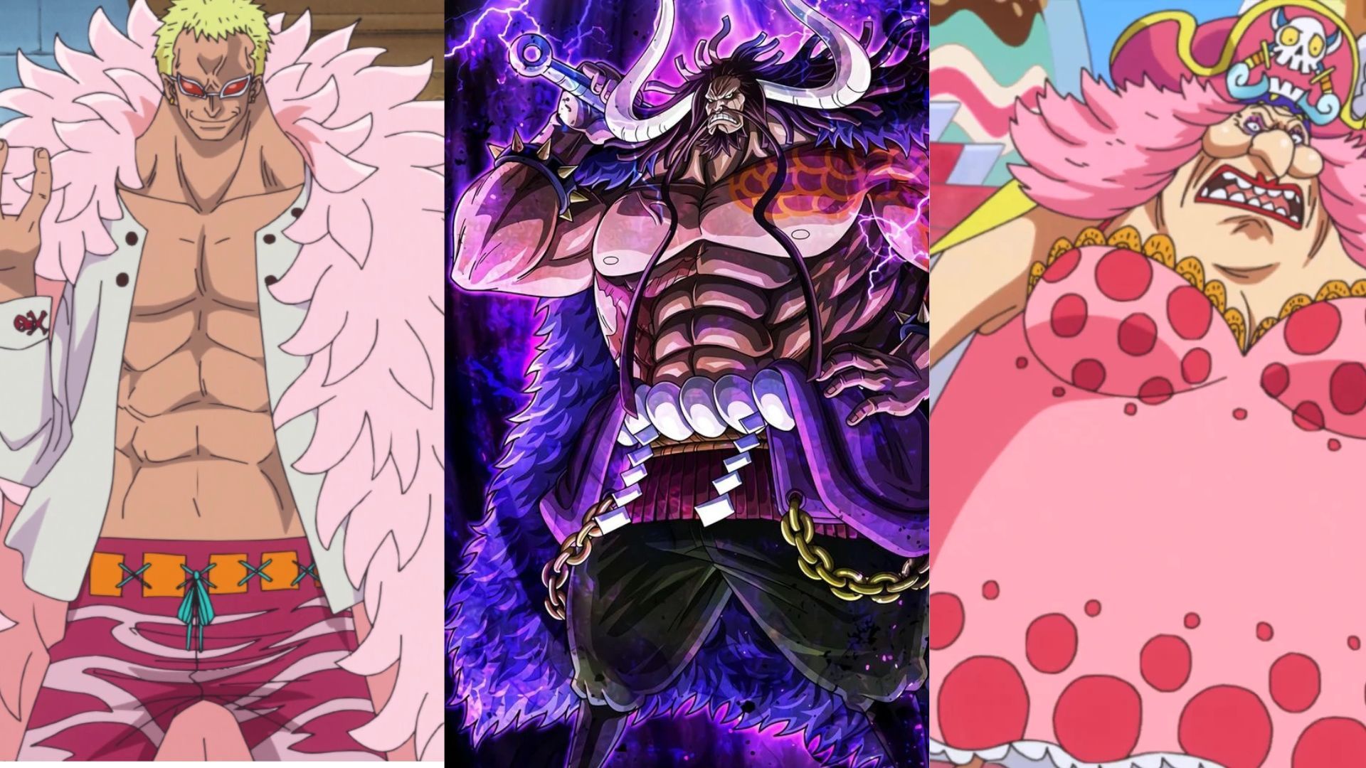
At first glance, the choice feels counterintuitive. Villains as terrifying as the Gorosei should look grim, right? But Oda has always subverted expectations with his designs. Consider:
- Doflamingo, a sadistic tyrant, dressed in flamboyant pink feathers.
- Kaido, the “Strongest Creature,” has a bright blue dragon form.
- Big Mom, an emperor of the sea, had a multicolored, candy-like design.
Oda’s villains often embody excess. They are too colorful, too loud, too extravagant. Their appearance reflects their arrogance and their distorted view of themselves as gods or rulers. By contrast, the Straw Hats are relatively grounded in design, distinct, but not absurdly flamboyant.
The Gorosei’s colors in One Piece might therefore be a deliberate choice. Their godlike forms are not just weapons; they are spectacles, designed to awe, confuse, and terrify. Their grotesque vibrancy makes them feel alien, inhuman, and out of step with the natural world.
Symbolism behind the palettes
Color in One Piece has always carried symbolism. Here are a few possible readings:
- Green Warcury: Rot, corruption, and decay; the false “justice” of the World Government.
- Red Nusjuro: Blood, rage, and destruction; a horseman of war.
- Rainbow Mars: Pride and arrogance; the Elders flaunt power like untouchable gods.
- Bright Ju Peter: Mockery; his worm form may look comical, but it hides terrifying, destructive power.
- Saturn’s muted tones: Authority and stability; he is the most public-facing Elder, appearing calm but dangerous.
Seen together, the Elders look like a twisted pantheon, a parody of gods, each embodying excess rather than balance. As always with One Piece, the smallest details carry big meaning. And while fans will debate whether Warcury looks like broccoli or Mars looks like a festival float, one truth stands out: Oda never designs anything by accident.
The Gorosei’s official colors in One Piece might be another layer in the long game he’s been playing all along.