Wes Anderson is probably one of the most recognizable filmmakers today. It's easy to identify his style, and his films get talked about by audiences. He has a reputation for meticulous attention to detail and his special way of telling stories. Anderson's films incorporate a combination of symmetry, color, and whimsical storytelling that helped to establish what a "signature style" in contemporary film looks like.
At the center of Anderson's filmmaking is his firm grasp of every aspect of the film. Studio Binder has referred to this as "direct-directing." Everything in his films is planned: the appearance of the scenes, the way the characters speak, and the way they move.
Most directors attempt to make their movies feel natural and real. Anderson does the opposite. He makes you feel like paying attention to how it is made. He flaunts the sets, the carefully staged scenes, how the characters are positioned, and how narrators and chapter headings are used. All this self-referential technique is a huge part of his films. That's also the reason his films are studied and mimicked so frequently.
Wes Anderson's most well-known visual trick is symmetry. Nearly every people-and-objects composition in his shots is evenly distributed across the frame. This is a balanced and tidy appearance that is pleasing to the viewer and emotionally engaging. It makes his movies feel very ordered.
Color is also extremely significant in his films. Every film has a color scheme, which is selected to complement the mood, period, or subject. Wes Anderson frequently employs pastels or bright, bold hues. These contribute to the dreamy, otherworldly atmosphere that pervades much of his work.
Next, we’ll look at ten small but important details hidden in Wes Anderson’s films. These touches may be easy to miss, but they help explain what makes his style so unique and memorable.
Disclaimer: This article is based on the writer's opinions. Reader discretion is advised.
The Royal Tenenbaums: Margot's wooden finger and sibling scars

One of the strongest small details in The Royal Tenenbaums is Margot's wooden ring finger. Initially, it's noticeable. Its color and texture are distinct from her actual fingers. Thin white bandaging secures it.
As the film progresses, it blends with all the other props in the Tenenbaum home. Nevertheless, the finger signifies something more. Margot lost it in an accident during her attempts to reconnect with her birth family. This indicates her continued sense of not belonging.
The wooden finger makes her stand out from both her biological and adoptive families. It symbolizes how isolated she feels. Interestingly, both her brothers bear scars on their hands. Each of them results from family-based suffering.
These marks are physical representations of the inner turmoil that unites the siblings, even behind their strange personas.
Rushmore: The curtains and theatrical structure
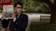
In Rushmore, Wes Anderson employs red velvet curtains to open and close every "chapter" of the movie. It's not just a stylistic choice. It's a nod directly to Max Fischer's affinity for theater and the way that he perceives his life as a play.
The curtains turn the movie into a series of acts, like a staged play. This mirrors the way Max perceives the world—as his stage. It muddles the distinction between what's real and what's performance.
This nifty illusion also alludes to the ultimate school play, bringing the entire story full circle as if Max had schemed it all along.
The Life Aquatic with Steve Zissou: The red cap tribute

In The Life Aquatic with Steve Zissou, the crew’s red knit caps seem like a fun costume detail. But they’re a tribute to Jacques Cousteau, the real-life ocean explorer whose team wore similar hats.
It’s easy to miss the meaning behind them. But these caps link Zissou’s made-up adventures to real-world exploration.
They help show the movie’s mix of fact and fantasy. The hats are signs of respect, memory, and the divide between documentary and fiction.
Moonrise Kingdom: The hidden map and childhood escapism

Moonrise Kingdom is full of magic and childlike imagination. One such hidden element is the hand-drawn map created by Sam and Suzy, the child protagonists. We have glimpses of it from above in some of the scenes.
It's more than a mere prop. The map illustrates their aspiration to escape and carve out their path in life. Its small, fairy-tale-like details indicate the way they perceive life, with imagination and optimism. It's a metaphor for their path to maturity and freedom.
The Grand Budapest Hotel: The changing aspect ratios

One of the most understated yet intricate stunts in The Grand Budapest Hotel is the way it employs various screen sizes (aspect ratios) for various time frames.
The scenes in the 1930s employ the vintage 1.37:1 "Academy" ratio. The 1960s employed the widescreen 2.35:1 format. The scenes in the 1980s follow 1.85:1. These adjustments inform the viewer when each scene takes place. They also nod to the film styles of each era.
Wes Anderson subtly adds extra layers of time, history, and style to the narrative.
Fantastic Mr. Fox: The whack-bat rules explained

In Fantastic Mr. Fox, the animals get together to play this bizarre game called Whack-Bat. It's described in a rapid, bewildering sequence. The rules are so complex that most spectators simply abandon trying to keep up.
And that's the punchline—it's done to mock how ridiculous and over-the-top actual sports can be. This rapid sequence creates a subtle joke about how animals and humans obey quirky, useless rules.
The Darjeeling Limited: The luggage monogram
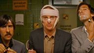
In The Darjeeling Limited, the three brothers each have identical luggage. Each has the initials "J.L.W." These letters are in tribute to their deceased father, John L. Whitman.
The luggage was created by Marc Jacobs for Louis Vuitton. It symbolizes more than it initially seems. The bags reflect the brothers' emotional baggage. They're identical, yet each one is scratched and worn differently. That is similar to how the brothers have a common past but their own wounds.
While they journey through India, the luggage accompanies them on their process of forgiveness, comprehension, and letting go.
Isle of Dogs: The visual kanji puns

Isle of Dogs is full of subtle visual jokes, particularly in the Japanese script that appears on signs and posters. For instance, the "Trash Island" sign is written in kanji that translates to "island of garbage."
However, the characters are designed to resemble heaps of trash. These little details are humorous for Japanese speakers. They also give the world of the film depth. Even minor signs demonstrate how much attention was put into making the environment feel real and playful.
Bottle Rocket: The yellow jumpsuits and group identity
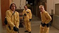
In Bottle Rocket, the protagonists dress in identical yellow jumpsuits during a robbery. The attire is humorous but also symbolic. The jumpsuits resemble prison garb or pajamas. They suggest the characters' immaturity and desire to belong.
Wes Anderson reused similar uniform motifs in The Life Aquatic and Moonrise Kingdom. Here, it's the first indication of how he develops themes of belonging vs. standing out.
Asteroid City: Alien's secret cameos

The alien doesn't pop up once in Asteroid City. Instead, it's visible for brief moments a number of times, leading up to the big reveal. Pay attention and you'll spot them—otherworldly shadows, reflections, or fleeting silhouettes at the back of the scene.
These secret teases create anticipation. They reward observant viewers with a deeper, richer understanding of the story.
Love movies? Try our Box Office Game and Movie Grid Game to test your film knowledge and have some fun!
